到目前为止,我们已经按顺序写完了:
Row/Column:沿一个方向排(主轴/交叉轴)。Stack:做覆盖(角标、浮层、背景图)。Flex:做换行与流式分布(chips、标签区)。
但你很快会遇到一种“Stack 和 Row/Column 都不顺手”的布局:同一块区域里塞了好几个控件(角标、按钮、标题区),它们要彼此对齐,而且对齐关系是“依赖另一个控件的位置”。
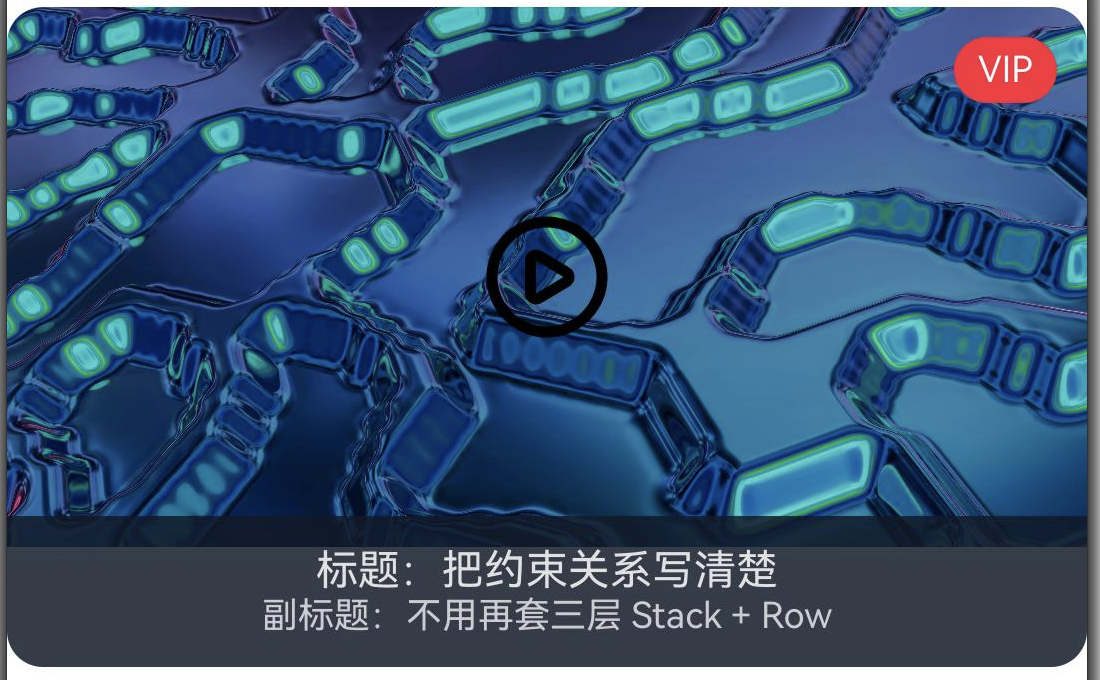
本文我们来讲一个实际案例:做一张视频封面卡片。它包含右上角 VIP 角标、居中的播放按钮、底部标题区。重点不是把卡片画出来,而是把“谁贴谁、谁居中、谁贴底”这些约束信息写清楚。
约束信息梳理
当你说“我要一个角标在右上角、一个按钮在正中间、标题贴在底部”,这句话背后其实是三类约束:
- 对容器的约束:贴容器边、居中、距边多少。
- 对同伴的约束:贴着某个控件的右边/下边/对齐其中心线。
- 同时满足多条约束:比如输入框左边贴 label,右边贴容器右侧,还要垂直与 label 对齐。
在 Android View 体系里,你很自然会想到 ConstraintLayout。在 ArkUI 里,对应的“主力容器”就是 RelativeContainer。
ArkUI:RelativeContainer 写封面卡片(角标 + 播放按钮 + 标题区)
我们用一个“视频封面卡片”例子,把常见的三件套放进同一张卡片:
- 右上角:
VIP角标(贴容器右上) - 正中间:播放按钮(容器居中)
- 底部:标题与副标题(贴底,左右留边)
示例里假设资源目录中有两个图片资源:
cover_movie:一张横向封面图,负责撑起卡片背景。本文配套资源是assets/cover_movie.jpg。ic_play_circle:一个播放按钮图标,放在封面正中间。本文配套资源是assets/ic_play_circle.svg。
@Entry
@Component
struct CoverCardDemo {
  build() {
    RelativeContainer() {
      Image($r('app.media.cover_movie'))
        .width('100%')
        .height(180)
        .id('cover')
        .alignRules({
          top: { anchor: '__container__', align: VerticalAlign.Top },
          left: { anchor: '__container__', align: HorizontalAlign.Start },
          right: { anchor: '__container__', align: HorizontalAlign.End }
        })

      Text('VIP')
        .fontSize(12)
        .fontColor(Color.White)
        .padding({ left: 8, right: 8, top: 4, bottom: 4 })
        .backgroundColor('#EF4444')
        .borderRadius(999)
        .id('badge')
        .alignRules({
          top: { anchor: '__container__', align: VerticalAlign.Top },
          right: { anchor: '__container__', align: HorizontalAlign.End }
        })
        .margin({ top: 10, right: 10 })

      Image($r('app.media.ic_play_circle'))
        .width(44)
        .height(44)
        .id('play')
        .alignRules({
          center: { anchor: 'cover', align: VerticalAlign.Center },
          middle: { anchor: 'cover', align: HorizontalAlign.Center }
        })

      Column() {
        Text('标题:把约束关系写清楚')
          .fontSize(14)
          .fontColor(Color.White)
          .maxLines(1)
          .textOverflow({ overflow: TextOverflow.Ellipsis })
        Text('副标题:不用再套三层 Stack + Row')
          .fontSize(12)
          .fontColor('#E5E7EB')
          .maxLines(1)
          .textOverflow({ overflow: TextOverflow.Ellipsis })
      }
      .id('meta')
      .padding({ left: 12, right: 12, top: 10, bottom: 10 })
      .backgroundColor('#111827')
      .opacity(0.85)
      .alignRules({
        left: { anchor: '__container__', align: HorizontalAlign.Start },
        right: { anchor: '__container__', align: HorizontalAlign.End },
        bottom: { anchor: '__container__', align: VerticalAlign.Bottom }
      })
    }
    .width('100%')
    .height(220)
    .borderRadius(12)
    .clip(true)
  }
}
最终的实现效果:
- 每个“要被引用的组件”都要
.id("...")。 __container__是最常用的锚点:贴边、铺满、对齐边界。- 先写约束,再用
.margin(...)微调间距,别把间距混进约束里。
这里不要继续用默认的 app_icon 做演示资源。app_icon 是应用入口标识,不是内容图片;封面卡片里应该区分“内容图”和“操作图标”,这样读者才能把资源职责和布局职责一起理解清楚。
Android:同一个封面卡片,ConstraintLayout/Compose 里通常怎么写
View/XML:ConstraintLayout
<androidx.constraintlayout.widget.ConstraintLayout
    android:layout_width="match_parent"
    android:layout_height="220dp">

    <ImageView
        android:id="@+id/cover"
        android:layout_width="0dp"
        android:layout_height="180dp"
        app:layout_constraintTop_toTopOf="parent"
        app:layout_constraintStart_toStartOf="parent"
        app:layout_constraintEnd_toEndOf="parent" />

    <TextView
        android:id="@+id/badge"
        android:layout_width="wrap_content"
        android:layout_height="wrap_content"
        android:layout_marginTop="10dp"
        android:layout_marginEnd="10dp"
        app:layout_constraintTop_toTopOf="parent"
        app:layout_constraintEnd_toEndOf="parent" />

    <ImageView
        android:id="@+id/play"
        android:layout_width="44dp"
        android:layout_height="44dp"
        app:layout_constraintTop_toTopOf="@id/cover"
        app:layout_constraintBottom_toBottomOf="@id/cover"
        app:layout_constraintStart_toStartOf="@id/cover"
        app:layout_constraintEnd_toEndOf="@id/cover" />

    <LinearLayout
        android:id="@+id/meta"
        android:layout_width="0dp"
        android:layout_height="wrap_content"
        app:layout_constraintStart_toStartOf="parent"
        app:layout_constraintEnd_toEndOf="parent"
        app:layout_constraintBottom_toBottomOf="parent" />
</androidx.constraintlayout.widget.ConstraintLayout>
Compose:ConstraintLayout
ConstraintLayout(Modifier.fillMaxWidth().height(220.dp)) {
  val (cover, badge, play, meta) = createRefs()

  Image(painterResource(R.drawable.cover), null,
    modifier = Modifier
      .fillMaxWidth()
      .height(180.dp)
      .constrainAs(cover) { top.linkTo(parent.top) })

  Text("VIP",
    modifier = Modifier.constrainAs(badge) {
      top.linkTo(parent.top, 10.dp)
      end.linkTo(parent.end, 10.dp)
    })

  Icon(Icons.Default.PlayArrow, null,
    modifier = Modifier.constrainAs(play) { centerTo(cover) })

  Column(Modifier.constrainAs(meta) {
    start.linkTo(parent.start)
    end.linkTo(parent.end)
    bottom.linkTo(parent.bottom)
  }) { /* title/subtitle */ }
}
迁移到 ArkUI 时,不需要逐行翻译。你只要保留三件事就够了:
- 锚点命名(Android 是 view id /
ConstrainedLayoutReference,ArkUI 是.id(...)) - 关系列表(谁贴 parent,谁贴 cover,谁居中)
- 关系与间距分离(先让关系成立,再用 margin/padding 调距离)
迁移清单:从“画出来”到“好改”
当你在 Android ↔ HarmonyOS 间迁移这类布局时,可以参考的 checklist 是:
- 先写“关系清单”(谁贴谁、谁居中、谁铺满),再动手写代码。
- 能引用就必须命名锚点(id/标识),不要用“猜出来的层级位置”。
- 贴边、铺满优先用容器锚点(
parent/__container__)。 - 约束先写核心边界,再补居中与间距(别一开始就写得太花)。
- 一次只引入一个容器:不要在 RelativeContainer 里再套多层 Stack/Row(除非你明确知道为什么)。
- 把“关键卡片布局”做成回归用例:截图对比或 UI 自动化都行,避免改一处牵一片。
对照表:RelativeContainer ↔ ConstraintLayout
| 你脑子里的问题 | Android(View/XML)常用做法 | ArkUI(ArkTS)常用做法 | 迁移要点 |
|---|---|---|---|
| “谁是锚点?” | app:layout_constraint* 指向另一个 view 的 id |
alignRules({ ... anchor: "xxx" ... }) 指向另一个组件 .id("xxx") |
都是“先给锚点命名”,再写关系 |
| “贴容器边怎么写?” | ..._toStartOf="parent" / ..._toEndOf="parent" |
anchor: "__container__" + HorizontalAlign.Start/End |
ArkUI 把“父容器”当成一个特殊锚点 |
| “上下左右 + 居中怎么表达?” | 多条 constraint + bias / chain | top/left/right/bottom/center 等规则组合 |
先写核心的边界约束,再补居中/分布 |
| “怎么避免嵌套地狱?” | 用一层 ConstraintLayout 代替多层嵌套 | 用一层 RelativeContainer 代替多层 Row/Column/Stack | 思路相同:用关系代替层级 |
参考素材(精选)
- OpenHarmony RelativeContainer(含
alignRules与示例) - Android ConstraintLayout(Views)
- ConstraintLayout in Compose
// Kai@CodeHubble
// 观测坐标:Android-HarmonyOS/2026-05-26