打开一个 Android 老项目的 res/values/styles.xml,按钮样式经常不是一两个颜色,而是一棵小树:
Widget.App.BrandButton
Widget.App.BrandButton.Primary
Widget.App.BrandButton.Primary.Dense
Widget.App.BrandButton.Secondary
Widget.App.BrandButton.Secondary.Dense
Widget.App.BrandButton.Danger
Widget.App.BrandButton.Danger.Dense
这棵树在 Android 里很好用。页面里写一个 style="@style/Widget.App.BrandButton.Primary.Dense",按钮就能拿到默认高度、字号、圆角、主题色、深浅色、禁用态和按压态。
迁到 ArkUI 时,第一反应通常是包一个 BrandButton:
BrandButton({
  text: '提交',
  tone: 'primary',
  size: 'dense'
})
这条路不是不能走,问题是它很快会把基础控件的开放性收窄。Android 里 BrandButton : TextView 仍然是一个 TextView,调用方还能继续用原来的 XML 属性。ArkUI 里包出来的 BrandButton 是组合组件,外部想改 .fontSize()、.type()、.constraintSize()、.accessibilityText(),组件作者没有提前暴露就用不了。
同一个按钮样式迁过去,先不要问“ArkUI 里怎么写一个 BrandButton”。接下来按旧 style 树里的变化类型拆:每一类变化,在 ArkUI 里应该落到哪一层。
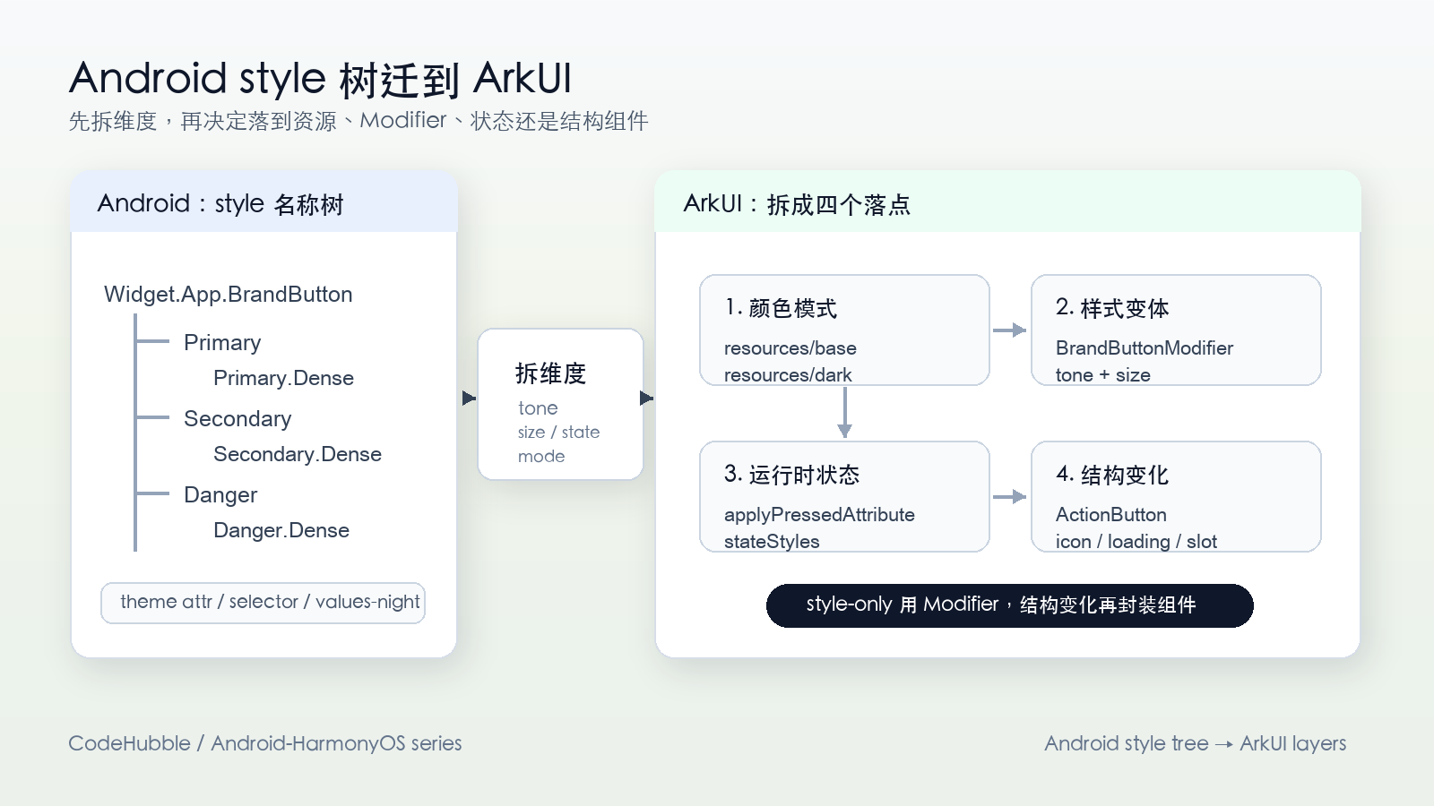
Android 的顺手之处:style 链替控件接住了变化
先看 Android 侧的按钮。它继承 AppCompatTextView,构造函数里带着 defStyleAttr:
class BrandButton @JvmOverloads constructor(
    context: Context,
    attrs: AttributeSet? = null,
    defStyleAttr: Int = R.attr.brandButtonStyle
) : AppCompatTextView(context, attrs, defStyleAttr) {

    init {
        isClickable = true
        isFocusable = true
        gravity = Gravity.CENTER
    }
}
主题给它一个默认 style 入口:
<!-- res/values/attrs.xml -->
<attr name="brandButtonStyle" format="reference" />
<!-- res/values/themes.xml -->
<style name="Theme.App" parent="Theme.MaterialComponents.DayNight.NoActionBar">
<item name="brandButtonStyle">@style/Widget.App.BrandButton</item>
</style>基础样式放在 styles.xml:
<!-- res/values/styles.xml -->
<style name="Widget.App.BrandButton">
    <item name="android:minHeight">44dp</item>
    <item name="android:paddingLeft">16dp</item>
    <item name="android:paddingRight">16dp</item>
    <item name="android:textSize">15sp</item>
    <item name="android:textStyle">bold</item>
    <item name="android:background">@drawable/bg_brand_button</item>
    <item name="android:textColor">?attr/colorOnPrimary</item>
</style>
然后派生几个变体:
<style name="Widget.App.BrandButton.Primary">
    <item name="android:backgroundTint">?attr/colorPrimary</item>
    <item name="android:textColor">?attr/colorOnPrimary</item>
</style>

<style name="Widget.App.BrandButton.Secondary">
    <item name="android:backgroundTint">?attr/colorSecondaryContainer</item>
    <item name="android:textColor">?attr/colorOnSecondaryContainer</item>
</style>

<style name="Widget.App.BrandButton.Primary.Dense">
    <item name="android:minHeight">36dp</item>
    <item name="android:paddingLeft">12dp</item>
    <item name="android:paddingRight">12dp</item>
</style>
页面里使用时只换 style 名称:
<com.example.ui.BrandButton
    style="@style/Widget.App.BrandButton.Primary.Dense"
    android:layout_width="wrap_content"
    android:layout_height="wrap_content"
    android:text="提交" />
这套写法背后有几层能力在一起工作:
| 层 | Android 常见落点 | 承担的变化 |
|---|---|---|
| 控件类型 | BrandButton : TextView |
继承原有 View 能力,补少量自定义行为 |
| 默认样式入口 | defStyleAttr = R.attr.brandButtonStyle |
主题给控件设置默认 style |
| 页面覆写 | style="@style/..." |
单个调用点切换样式 |
| 变体继承 | Widget.App.BrandButton.Primary.Dense |
通过 style 名称或 parent 复用基础项 |
| 状态 | selector / state list | pressed、disabled、selected |
| 深浅色 | values-night / DayNight theme |
同名资源在不同颜色模式下取不同值 |
Android 自定义控件的宽松之处就在这里:控件类不一定知道所有变体。资源系统会把 style、theme、selector、night resource 算成最终属性,再交给 View。
先把旧 style 树拆成四个维度
旧 style 名称看起来是一棵继承树,里面其实混了四类变化:
tone: primary / secondary / danger
size: normal / dense
state: enabled / disabled / pressed
mode: light / dark
迁到 ArkUI 时,先按这四类拆:
| 旧 style 信息 | ArkUI 落点 |
|---|---|
Primary / Secondary / Danger |
设计语义,适合做 tone |
Normal / Dense |
尺寸密度,适合做 size |
Pressed / Disabled / Focused |
运行时状态,适合放 applyXxxAttribute 或 stateStyles |
Light / Dark |
颜色模式,适合放 resources/base 和 resources/dark |
| 页面临时覆写 | 调用点属性链,或追加一个轻量 modifier |
| icon / loading / 权限态 | 结构和业务状态,才考虑自定义组件 |
后面的 ArkUI 代码都沿着这张表走。先放资源,再写 modifier,最后才看自定义组件。
第一层:深浅色留在资源里
不要把深浅色写成 tone: 'primaryDark',也不要写 PrimaryDarkDenseButtonModifier。Android 里调用点不会写 PrimaryDarkDense,ArkUI 里也应该让颜色模式留在资源层。
先定义浅色资源:
// resources/base/element/color.json
{
  "color": [
    { "name": "brand_button_primary_bg", "value": "#2563EB" },
    { "name": "brand_button_primary_text", "value": "#FFFFFF" },
    { "name": "brand_button_secondary_bg", "value": "#E5E7EB" },
    { "name": "brand_button_secondary_text", "value": "#111827" },
    { "name": "brand_button_secondary_border", "value": "#CBD5E1" },
    { "name": "brand_button_danger_bg", "value": "#DC2626" },
    { "name": "brand_button_danger_text", "value": "#FFFFFF" }
  ]
}
再定义深色资源:
// resources/dark/element/color.json
{
  "color": [
    { "name": "brand_button_primary_bg", "value": "#3B82F6" },
    { "name": "brand_button_primary_text", "value": "#FFFFFF" },
    { "name": "brand_button_secondary_bg", "value": "#374151" },
    { "name": "brand_button_secondary_text", "value": "#F9FAFB" },
    { "name": "brand_button_secondary_border", "value": "#4B5563" },
    { "name": "brand_button_danger_bg", "value": "#F87171" },
    { "name": "brand_button_danger_text", "value": "#111827" }
  ]
}
后面的 ArkTS 代码只引用 $r('app.color.brand_button_primary_bg') 这样的语义资源。系统进入深色模式时,资源限定目录负责切换具体颜色。局部预览或局部页面需要固定颜色模式时,再考虑 WithTheme({ colorMode })。
这一步对应 Android 的 values-night,不是对应 Android 的 style 继承。style 变体还没有开始处理。
第二层:style 变体落到 AttributeModifier
ArkUI 里 @Styles 和 @Extend 都能复用样式,但做跨项目组件库时会碰到限制:@Styles 不支持导出和传参,@Extend 能传参、能访问组件特有属性,但也不能跨文件导出。
AttributeModifier 更像组件库里的样式对象:可以导出,可以带参数,可以写逻辑,也可以挂在原生组件链上。
先把旧 style 名称拆成类型:
// ui/modifiers/BrandButtonModifier.ets
export type BrandButtonTone = 'primary' | 'secondary' | 'danger'
export type BrandButtonSize = 'normal' | 'dense'

export interface BrandButtonVariant {
  tone: BrandButtonTone
  size?: BrandButtonSize
}

interface BrandButtonColorTokens {
  background: ResourceColor
  text: ResourceColor
  border?: ResourceColor
}

interface BrandButtonSizeTokens {
  height: number
  paddingX: number
  fontSize: number
}
tone 只负责选语义颜色:
function buttonColors(tone: BrandButtonTone): BrandButtonColorTokens {
  switch (tone) {
    case 'secondary':
      return {
        background: $r('app.color.brand_button_secondary_bg'),
        text: $r('app.color.brand_button_secondary_text'),
        border: $r('app.color.brand_button_secondary_border')
      }
    case 'danger':
      return {
        background: $r('app.color.brand_button_danger_bg'),
        text: $r('app.color.brand_button_danger_text')
      }
    default:
      return {
        background: $r('app.color.brand_button_primary_bg'),
        text: $r('app.color.brand_button_primary_text')
      }
  }
}
size 只负责尺寸:
function buttonSize(size: BrandButtonSize): BrandButtonSizeTokens {
  if (size === 'dense') {
    return { height: 36, paddingX: 12, fontSize: 14 }
  }
  return { height: 44, paddingX: 16, fontSize: 15 }
}
最后把它们合成一个 modifier:
export class BrandButtonModifier implements AttributeModifier<ButtonAttribute> {
  private variant: BrandButtonVariant

  constructor(variant: BrandButtonVariant = { tone: 'primary', size: 'normal' }) {
    this.variant = {
      tone: variant.tone,
      size: variant.size ?? 'normal'
    }
  }

  private applyBase(instance: ButtonAttribute, opacity: number): void {
    const colors = buttonColors(this.variant.tone)
    const size = buttonSize(this.variant.size ?? 'normal')

    instance
      .height(size.height)
      .padding({ left: size.paddingX, right: size.paddingX })
      .fontSize(size.fontSize)
      .fontWeight(FontWeight.Medium)
      .borderRadius(size.height / 2)
      .backgroundColor(colors.background)
      .fontColor(colors.text)
      .opacity(opacity)

    if (colors.border) {
      instance.border({
        width: 1,
        color: colors.border
      })
    }
  }

  applyNormalAttribute(instance: ButtonAttribute): void {
    this.applyBase(instance, 1)
  }

  applyPressedAttribute(instance: ButtonAttribute): void {
    this.applyBase(instance, 0.88)
  }

  applyDisabledAttribute(instance: ButtonAttribute): void {
    this.applyBase(instance, 0.42)
  }
}
这里有一个细节。不要只在 applyPressedAttribute() 里写 .opacity(0.88),其他属性完全不写。属性变化触发 applyXxxAttribute 时,本次没有设置的属性可能恢复为默认值。把基础属性集中到 applyBase(),每个状态回调都先应用基础样式,再叠加状态差异,读代码也更清楚。
调用点仍然面对原生 Button:
Button('提交')
  .attributeModifier(new BrandButtonModifier({
    tone: 'primary'
  }))
  .onClick(() => {
    this.submit()
  })

Button('取消')
  .attributeModifier(new BrandButtonModifier({
    tone: 'secondary',
    size: 'dense'
  }))

Button('删除')
  .enabled(!this.isDeleting)
  .attributeModifier(new BrandButtonModifier({
    tone: 'danger'
  }))
这三个调用点对应 Android 里的:
Widget.App.BrandButton.Primary
Widget.App.BrandButton.Secondary.Dense
Widget.App.BrandButton.Danger
但 ArkUI 侧没有再复刻一棵 style 名称树,而是把 style 名称拆成了 tone + size。
页面覆写靠顺序,不靠继承
Android 里页面覆写通常写在 XML 属性或另一个 style 里。ArkUI 里更直接:modifier 后面继续接属性链。
Button('提交')
  .attributeModifier(new BrandButtonModifier({
    tone: 'primary'
  }))
  .fontSize(16)
  .constraintSize({ minWidth: 96 })
attributeModifier() 和普通属性方法如果设置同一个属性,后设置生效。上面 .fontSize(16) 写在 modifier 后面,会覆盖 modifier 里的 .fontSize(15)。如果顺序反过来,modifier 会盖掉调用点的设置。
需要拆“品牌样式”和“页面布局差异”时,可以追加一个小 modifier:
export class FullWidthButtonModifier implements AttributeModifier<CommonAttribute> {
  applyNormalAttribute(instance: CommonAttribute): void {
    instance.width('100%')
  }
}
调用:
Button('继续')
  .attributeModifier(new BrandButtonModifier({
    tone: 'primary',
    size: 'normal'
  }))
  .attributeModifier(new FullWidthButtonModifier())
这比写 PrimaryFullWidthButton、PrimaryDenseFullWidthButton 清楚。前一个 modifier 管设计系统,后一个 modifier 管当前页面布局。
modifier 也不要无限叠。一个调用点如果出现四五个 modifier,读代码的人要来回找每个类里改了什么属性。通常把品牌色、字号、圆角、内边距放进一个 design-system modifier;当前页面的宽度、外边距、对齐可以直接写在调用点,或者放进很轻的 layout modifier。
状态不是 tone
pressed、disabled、focused 是运行时状态,不是设计系统变体。不要把它们和 primary、secondary、danger 混成一组参数。
primary / secondary / danger -> tone
normal / dense              -> size
pressed / disabled          -> state
light / dark                -> color mode
AttributeModifier 已经有 applyPressedAttribute()、applyDisabledAttribute() 这类状态回调,适合处理按钮这类组件的状态属性。简单场景也可以用 stateStyles:
@Styles
pressedStyle() {
  .opacity(0.88)
}

@Styles
normalStyle() {
  .opacity(1)
}

Button('提交')
  .stateStyles({
    normal: this.normalStyle,
    pressed: this.pressedStyle
  })
stateStyles 更像 CSS 伪类,主要适合通用属性。遇到组件特有属性、跨文件导出、传参、按 tone / size 做逻辑判断,还是回到 AttributeModifier。
这类 API 后面很容易走偏:
BrandButton({
  primary: true,
  danger: false,
  compact: true,
  dark: false,
  pressed: false,
  disabled: false
})
这些布尔值看起来方便,实际是在把四个维度塞到一层。更清楚的调用点应该是:
Button('删除')
  .enabled(!this.isDeleting)
  .attributeModifier(new BrandButtonModifier({
    tone: 'danger',
    size: 'dense'
  }))
深浅色由资源目录处理,按压态由状态回调或 stateStyles 处理,业务语义由 tone 处理。
结构变化再写自定义组件
AttributeModifier 解决的是属性复用,不解决结构复用。按钮里多了左图标、loading、角标、权限态,内部已经不是简单 Button('提交'),这时候再写组件。
@Component
export struct ActionButton {
  text: ResourceStr = ''
  tone: BrandButtonTone = 'primary'
  size: BrandButtonSize = 'normal'
  loading: boolean = false
  disabled: boolean = false
  onAction?: () => void

  build() {
    Button() {
      Row({ space: 6 }) {
        if (this.loading) {
          LoadingProgress()
            .width(16)
            .height(16)
        }
        Text(this.text)
      }
      .alignItems(VerticalAlign.Center)
      .justifyContent(FlexAlign.Center)
    }
    .enabled(!this.disabled && !this.loading)
    .attributeModifier(new BrandButtonModifier({
      tone: this.tone,
      size: this.size
    }))
    .onClick(() => {
      this.onAction?.()
    })
  }
}这个组件暴露的是业务结构:loading、disabled、onAction。它内部仍然复用 BrandButtonModifier。style 层和结构层分开以后,后面加一个 IconActionButton 或 ConfirmActionButton,不会把基础按钮样式复制一遍。
如果这类组件要给多个项目用,可以预留一个很窄的逃生口,例如接收 extraModifier?: AttributeModifier<ButtonAttribute>,在内部确认非空后追加到 Button() 上。它适合改宽度、字号、无障碍描述这类外层属性,不适合让外部重写内部布局。
迁移时按这张表落文件
旧 Android style 树不要翻译成七个 ArkUI 组件,也不要翻译成七个 modifier 类。可以按下面这张表落文件:
| 旧项目里的东西 | ArkUI 里的落点 |
|---|---|
values/colors.xml / values-night/colors.xml |
resources/base/element/color.json 和 resources/dark/element/color.json |
Widget.App.BrandButton.Primary |
BrandButtonModifier({ tone: 'primary' }) |
Widget.App.BrandButton.Primary.Dense |
BrandButtonModifier({ tone: 'primary', size: 'dense' }) |
| selector 里的 pressed / disabled | applyPressedAttribute()、applyDisabledAttribute() 或 stateStyles |
| 页面里临时覆盖字号、宽度 | modifier 后面的属性链 |
| 带 icon / loading / 权限态的业务按钮 | ActionButton 这类结构组件,内部复用 modifier |
Android 的 style 链把很多事情藏在 XML 资源系统里。ArkUI 没有这条链,迁移时要把它摊开:颜色交给资源,样式变体交给 AttributeModifier,状态交给状态回调,结构交给自定义组件。
这个拆法看起来比 style="@style/..." 显式,但组件库边界会清楚很多。以后新增一个 warning 颜色,只改 BrandButtonTone 和 buttonColors();新增一个 compact 尺寸,只改 BrandButtonSize 和 buttonSize();新增 loading 结构,再改 ActionButton。每个变化都有固定位置。
参考素材(精选)
- Android Developers:Styles and themes
- Android Developers:Implement dark theme
- Android Developers:Create a custom view class
- HarmonyOS:资源分类与访问
- HarmonyOS:属性修改器 AttributeModifier
- HarmonyOS:@Styles 装饰器
- HarmonyOS:@Extend 装饰器
- HarmonyOS:设置应用内主题换肤
- HarmonyOS:stateStyles 多态样式
- HarmonyOS Samples:sample_in_harmonyos
// Kai@CodeHubble // 观测坐标:Android-HarmonyOS/2026-07-09